Bruce’s Pantry
Homestyle hot sauce
CLIENT
Bruce’s Pantry
DELIVERABLES
Branding, packaging design
ROLE
Brand Designer, graphic designer
TEAM
Myself
TIMEFRAME
2 months
TOOLS
Illustrator
Containing The Heat - Bruce’s Hot Sauce
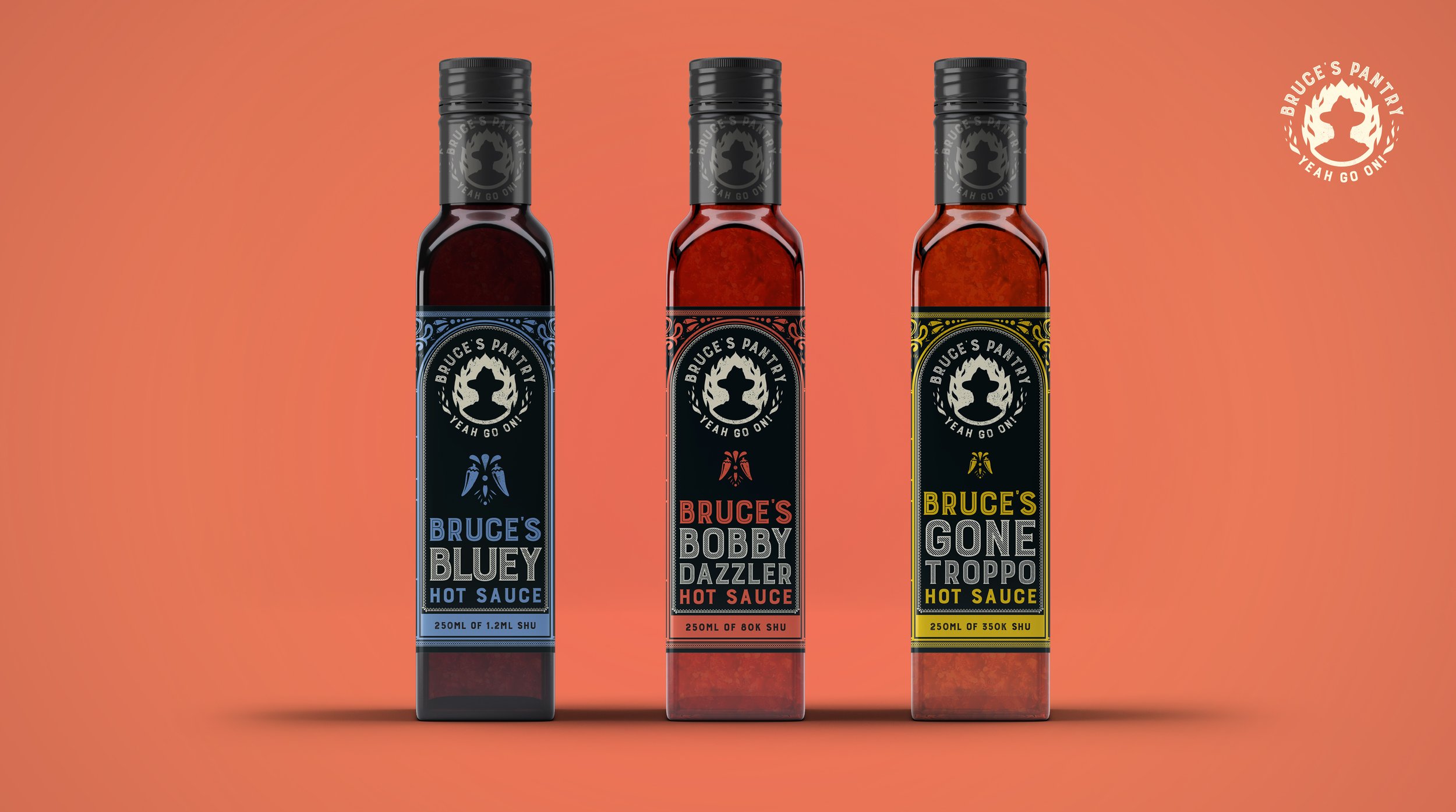
Bruce's Pantry, a homestyle condiments company, needed branding and packaging design that reflected its founder's true-blue Aussie roots and eccentric personality. The brand identity required loads of personality and a flexible system that allowed for new and various products to come. The identity combines vintage elements with bold modern styling, creating energetic compositions that incorporate custom flourish designs that are applied throughout packaging and branding elements.
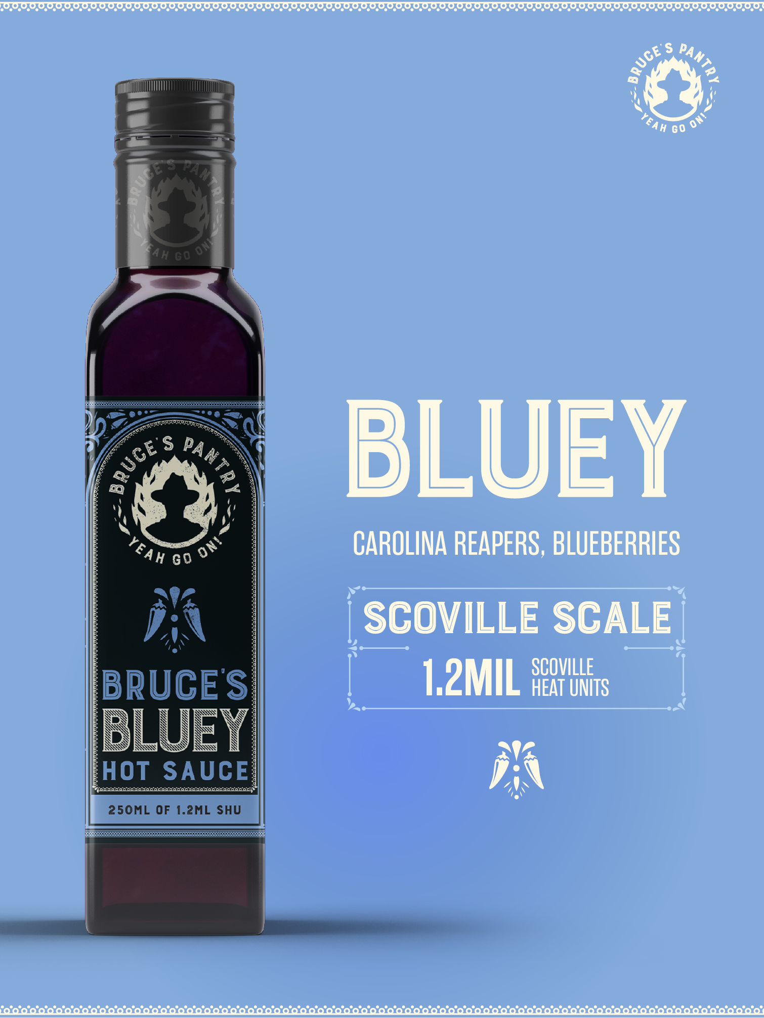
The fiery logo design centres around Bruce, with chunky typography paired with bold colour themes and snappy messaging. The flagship sauces - "Bobby Dazzler," "Bluey," and "Gone Troppo" - have names deeply rooted in Australian colloquialisms and flavour profiles as vibrant and lively as their namesakes.
Bruce's brand identity has a flexibility of colour that allows each label to signify the contents of its bottle through bold hues. Energetic movement of the logo and decorative imagery hint at the spicy delights contained inside – Yeah go on!